Ipalio

Bonhomme
Branding - Digital
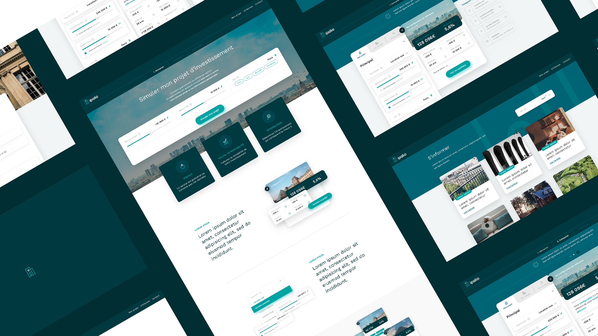
Ipalio is a comparative and informative platform in real estate investment. We took part in the creation of this flexible and innovative online comparator by offering an accessible identity and a streamlined user experience.
Well done and thank you to the entire Bonhomme team for their professionalism, sincerity and creativity! We wanted to create an intuitive and synthetic site despite the abundant data and complex interactions, all with an impeccable design. The challenge was more than met, we are delighted with the result and the users of ipalio.com too!
-
-
Graphical charter
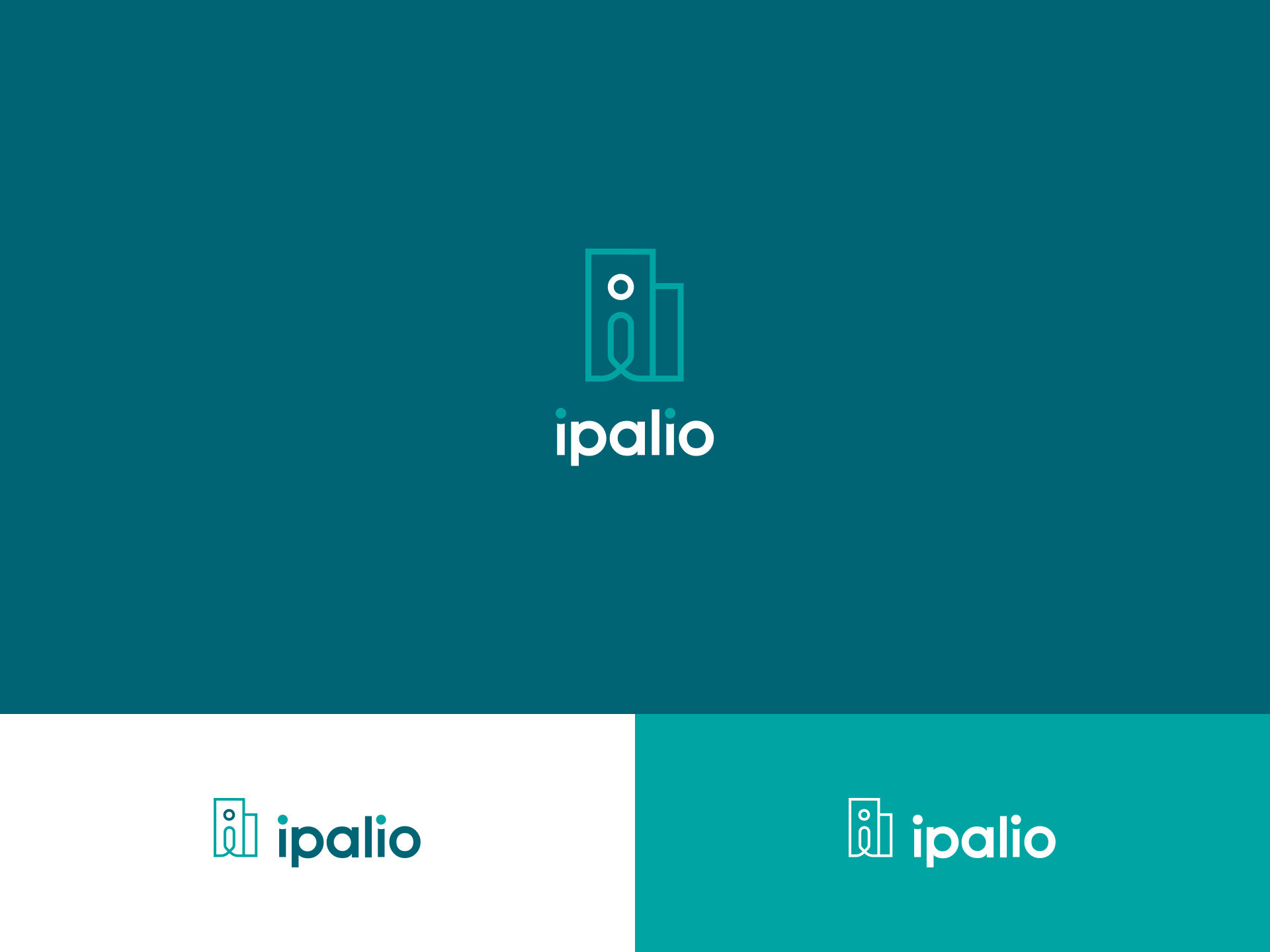
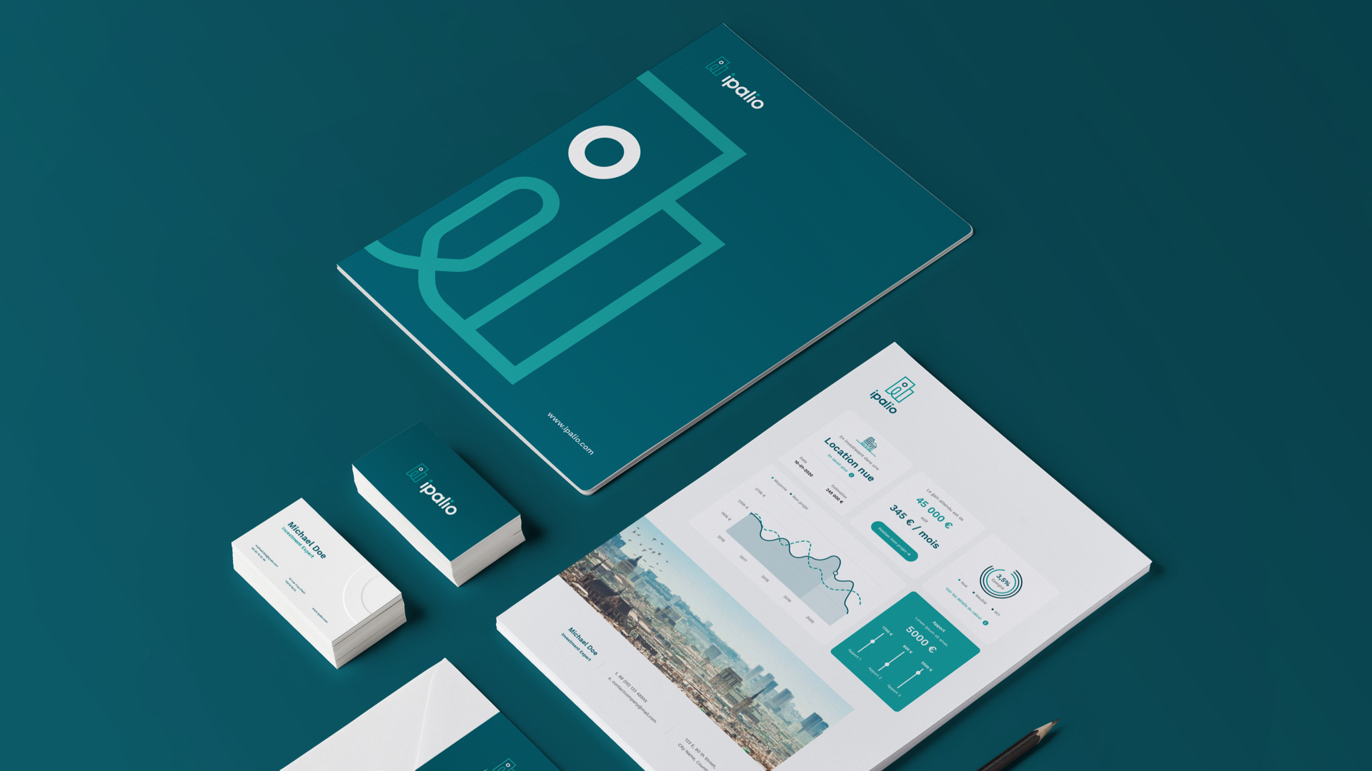
The round font written in lower case reveals the human and accessible side of Ipalio. The angular and geometric shapes assert a serious side and inspire trust. Last but not least, the blue-green colors conjure a dreamlike quality recalling the achievement of a personal project.
-
-
-
-
UX
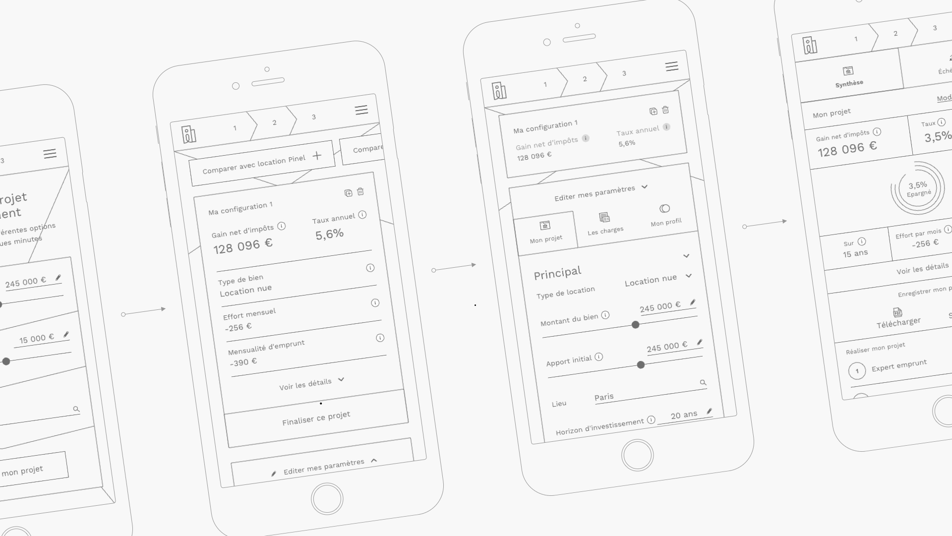
How to create an intuitive user experience with a complex subject and a large amount of data?As a vital stage within the project, the wireframing phase allowed us to define a precise path to guide the user step by step. The data's flexible and modular dimension was a big challenge to offer an easy-to-handle comparator.
-
-
Atomic Design
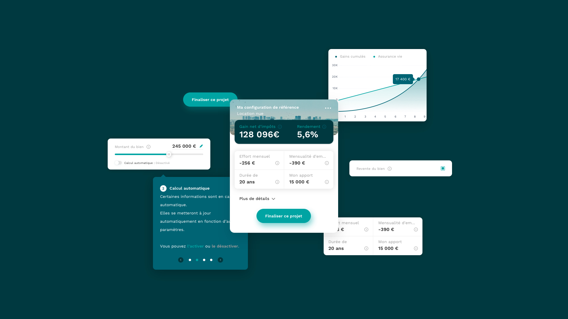
By first defining a library of graphical elements, we were able to create coherence throughout the different pages. Designs and components work just as well on mobile as on desktop, which makes the different types of content easily transposable from one screen to another.
-
-
Home Page
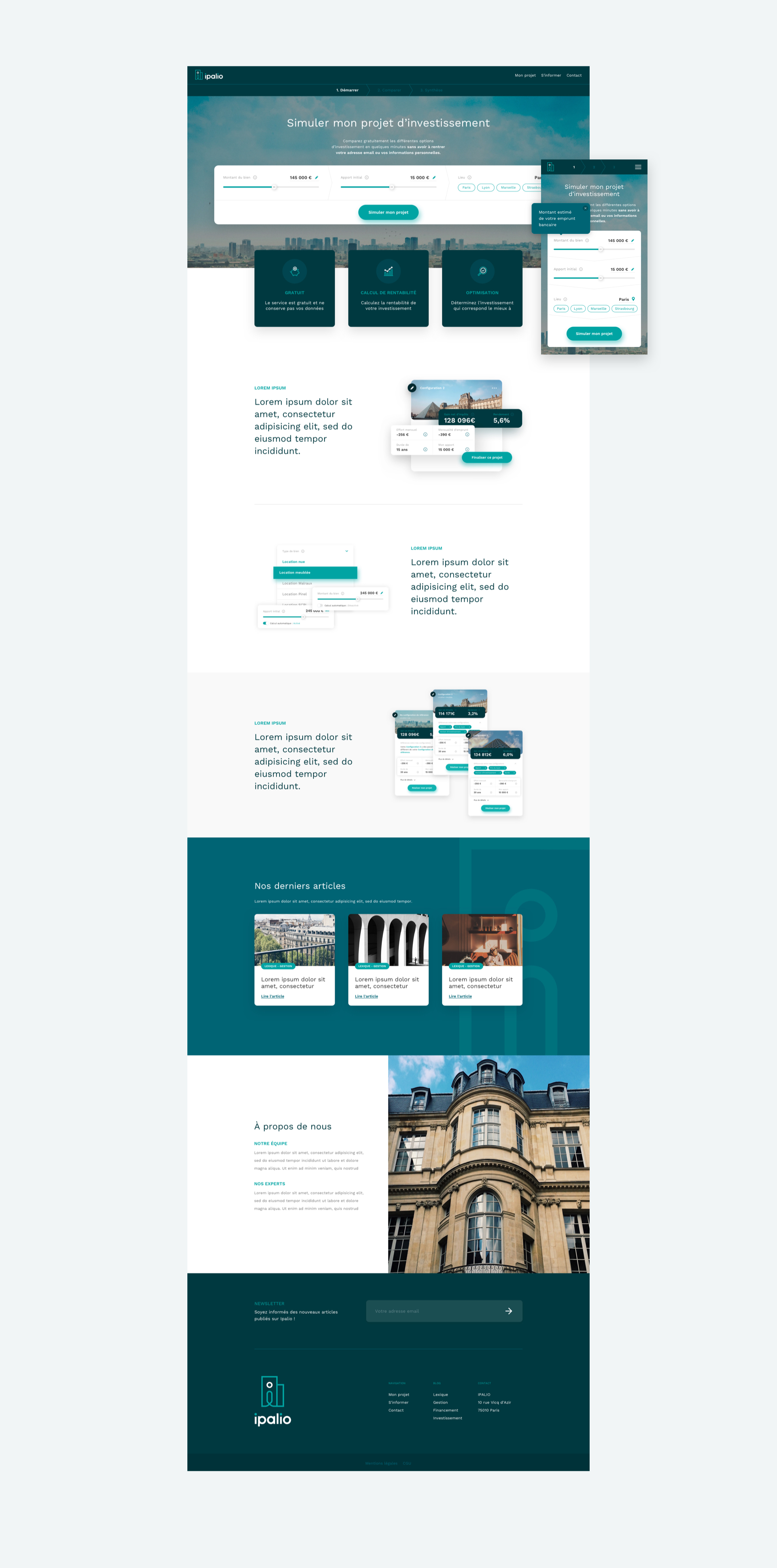
The home page offers an immediate access to the comparator, allowing users to define their real estate project in only a few clicks. Several reassurance blocks support the platform's many advantages.
-
-
Comparator
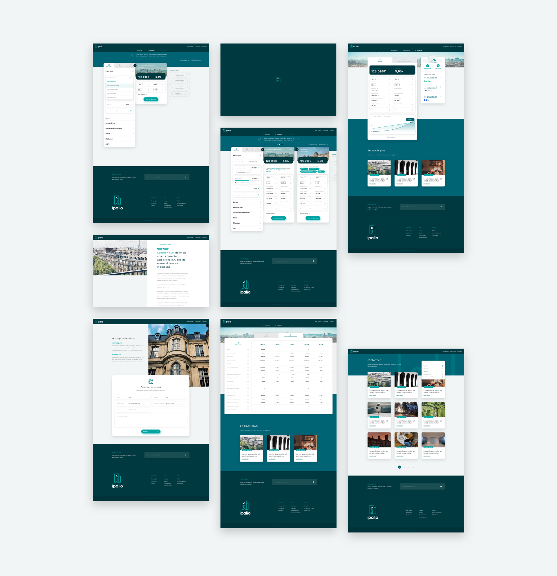
The streamlined user experience of the comparator is at the core of the service provided by Ipalio. We developed a didactic system guiding users throughout their browsing on the platform.
-
-
Mobile version
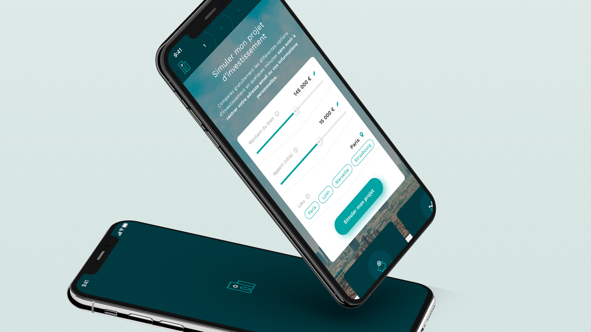
We met the challenge of designing a streamlined and intuitive mobile interface while taking into account the large amount of available data and their modular nature.
-
- Design
- Creative Direction
- Art Direction
- UX / UI
- Motion Design
- Project Management